What is the Worst-Case Scenario if You Dare to Vote for Anyone but a Republican?

Okay, so maybe the bible doesn't exactly say that, but evangelical voters in Arkansas know that voting for other candidates, such as "Libertarians" (even ones whose policies are populist rather than Libertarian) could "split the vote." This risks electing a Democrat to a statewide office. And if that happens, certain bad things could occur. The sun might be blotted out of the sky. Hailstones of fire the size of SUVs could rain down upon us. Or, more reasonably, the following could occur. I want to break down the "worst case scenario" of a conservative voting for a Libertarian over an awful Republican in each statewide race.
First of all, in each race, let's assume you vote for a Libertarian instead of a Republican rather than simply not voting in a race where you dislike both the Republican and Democratic candidate. This doesn't make a lot of sense for the down ballot races in particular because people skip voting for those all the time. But let's assume it since this is "worst case". If you typically vote Republican and don't vote for an office, that has the same risk of electing a Democrat as voting for a Libertarian. Skipping the race would actually be more empowering for the Democrat because if enough people voted for the Libertarian rather than simply not voting then even if the Democrat won, they would still win, but with less than 50% of the vote. In other words, they could not claim a "mandate from the people".
Let's also assume that your vote is the one vote that alters the outcome. In a statewide race, the odds of this are vanishingly small. If the Democrat gets 500,001 votes and the Republican 500,000 votes and the Libertarian 50,000 votes, then your one vote prevented the election from being a tie. The odds of that are really miniscule, but since we are talking "worst case scenario" here we can pretend your vote is the one that swings the whole statewide race. The much more likely outcome is that your 3rd party vote does what I described above- it reduces the size of the victory of the winner and if it is reduced below 50% of the vote, then they know they better be on their best behavior.
That being the case, what exactly are the unthinkable consequences when.....
In the Governor's Race:
Fred Love is elected over Sarah Sanders due to votes for Colt Shelby
This will have immediate and devastating consequences. Not for the state as a whole. But for certain lobbyists like Jon Gilmore, JR Davis, and Jamie Barker who have been directing huge flows of public money and private money hoping to influence public money. Not just them, all the grifters, insiders, and hangers on who have been sucking off the taxpayer's earnings will suddenly be cut off from the public treasury. Like I said, it will be devastating for the Republican consultant class in this state.
Fred Love will try to install a whole different group of parasites in their stead, but he will face an insurmountable obstacle. The legislature will still be 80% Republican, and our constitution makes our Governor one of the weakest if not the weakest in the nation.
A 51% vote of the legislature is all that is needed to override a veto. Our executive branch is split into seven offices some of which are appointed by the Governor in other states. The only reason the Governor is so powerful is that the same political party controls both the Executive and Legislative branches. This is an institutional end-run around the intent of the Founding Fathers to divide government into three branches that were supposed to check and balance one another. Instead, when they are in the same party, they enable each other. So when the same party controls both, government can do more than it could do when the intent of the Founders is preserved with divided government. Government could not do anything unless a large majority of the population approved. What a disaster that would be for growth of government!
For Lt. Governor: Libertarian Michael Kalagias beats Leslie Rutledge.
There is no Democrat in this race, so the "worst case scenario" would be the Libertarian winning. Nor does the Lt. Governor do much unless the Governor dies. The only devastating consequence I can think of in this scenario is to the political career of Leslie Rutledge. Kalagias is a crusty old curmudgeon, but he is legitimately for less government than Rutledge. Should he wind up in the Governor's office the same restrictions that would stop Fred Love would apply to Kalagias except they would not be needed. The Republican legislature would not have to slow him down, he would slow them down to the extent he could.
For Lt. Governor: Libertarian Michael Kalagias beats Leslie Rutledge.
There is no Democrat in this race, so the "worst case scenario" would be the Libertarian winning. Nor does the Lt. Governor do much unless the Governor dies. The only devastating consequence I can think of in this scenario is to the political career of Leslie Rutledge. Kalagias is a crusty old curmudgeon, but he is legitimately for less government than Rutledge. Should he wind up in the Governor's office the same restrictions that would stop Fred Love would apply to Kalagias except they would not be needed. The Republican legislature would not have to slow him down, he would slow them down to the extent he could.
For Secretary of State: Kelly Grappe is elected over Kim Hammer due to votes for Dr. Michael Pakko.
This isn't a redistricting cycle, and the SOS does not register voters or directly count the votes. The County Clerks do that. The SOS does not make election laws, the Legislature does that. They do have a role in defending election laws since they are the ones that get sued. So maybe if she thought an election law was unjust, she would not fight for it tooth and nail in a lawsuit. Kim Hammer would fight for any law the Republicans passed whether the law was just or not. After all, he was the primary sponsor of some of the most unjust election laws on the books today. But the Attorney General is normally the lawyer that represents the SOS in these cases, and that is still the hyper-partisan Tim Griffin.
This isn't a redistricting cycle, and the SOS does not register voters or directly count the votes. The County Clerks do that. The SOS does not make election laws, the Legislature does that. They do have a role in defending election laws since they are the ones that get sued. So maybe if she thought an election law was unjust, she would not fight for it tooth and nail in a lawsuit. Kim Hammer would fight for any law the Republicans passed whether the law was just or not. After all, he was the primary sponsor of some of the most unjust election laws on the books today. But the Attorney General is normally the lawyer that represents the SOS in these cases, and that is still the hyper-partisan Tim Griffin.
Given the way Grappe has conducted her campaign, using campaign donations to make her husband a paid employee and taking heavy reimbursements for meals and basically as much as she legally can, I can see that she would have to be watched closely as far has where the money goes. However, even if she wanted to be unethical, I strongly suspect she would be a rank amateur at grift compared the slick pros surrounding the GOP right now. Grift would likely be reduced, not even because she was so against it, but because it takes time and practice to be as good at it as state Republicans seem to be right now. Plus, that 80% Republican legislature would still control the purse strings and the Republican Attorney General would be a lot less likely to let her slide than Hammer. Considering how the Republicans have been willing to clamp down on voter petitions, third party and independent ballot access, and really any citizen access to government that does not go through them, this would be a good office to have a non-Republican in, just to keep them honest since they hold so much of the power.
For Land Commissioner, Libertarian Christopher Olson defeats Sander's acolyte Cole Jester.
For Land Commissioner, Libertarian Christopher Olson defeats Sander's acolyte Cole Jester.
Again, there is no Democrat in this race. Again, no one has to worry about "electing a Democrat" due to vote splitting. And the office is relatively inconsequential. There are only five states in which it is even an elected position. You probably can't even say what it does. But of course, you are supposed to be too crazed with fear to notice that and vote for the Republican anyway.
NOTE: This Christoper Olson is not the same person as my relative Christian Olson, who also ran for the office.
Other than irritating Sarah Sanders and snatching a stepping-stone away from Cole Jester (whom she appointed SOS), I honestly can't tell you what would be so terrible about the Republicans losing this race. There basically is no worst-case scenario. If you are not happy with Sanders, or Jester, but still won't vote for Olson for some DOA excuse you are determined to come up with, maybe you are just too fearful and this self-government thing isn't for you. I would suggest North Korea, as the Dear Leader there doesn't change every eight years and you don't have to bother coming up with excuses why you should keep supporting them. They save you the trauma by no longer pretending you have a choice, to the great relief of those like yourself who didn't really want one!
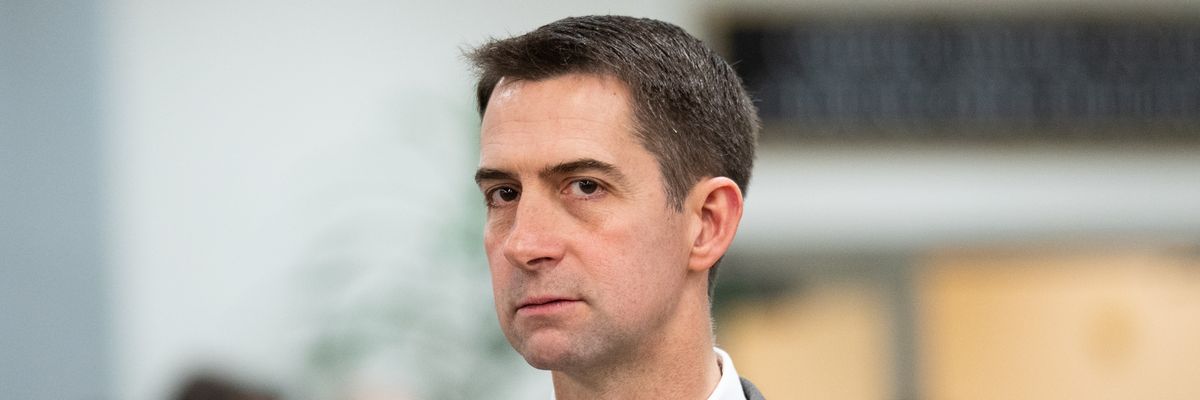
On the Federal Level: Hallie Shoffner is elected to the US Senate over Tom Cotton due to votes for Jeff Wadlin.
NOTE: This Christoper Olson is not the same person as my relative Christian Olson, who also ran for the office.
Other than irritating Sarah Sanders and snatching a stepping-stone away from Cole Jester (whom she appointed SOS), I honestly can't tell you what would be so terrible about the Republicans losing this race. There basically is no worst-case scenario. If you are not happy with Sanders, or Jester, but still won't vote for Olson for some DOA excuse you are determined to come up with, maybe you are just too fearful and this self-government thing isn't for you. I would suggest North Korea, as the Dear Leader there doesn't change every eight years and you don't have to bother coming up with excuses why you should keep supporting them. They save you the trauma by no longer pretending you have a choice, to the great relief of those like yourself who didn't really want one!
On the Federal Level: Hallie Shoffner is elected to the US Senate over Tom Cotton due to votes for Jeff Wadlin.
Hallie Shoffner reminds me of a younger, much greener, Blanche Lincoln type. That's not a compliment. And while she would just be one of a hundred Senators, there is a non-zero chance that the Senate will flip this election. The House has a higher chance of going from Red to Blue. This is also the Federal government, which has a lot more power than the state government, and far more power than the Founding Fathers ever intended it to have. So unlike some of the above offices, this could matter, if FEDGOV is not so far gone that nothing we can do matters and implosion is eminent.
That said, unlike with Governor, we have a very strong Presidency. Almost an Imperial Presidency, and that is the way the legislative branch seems to like it- all tough decisions are taken out of their hands. It doesn't just take a majority to impeach a President, it takes a 2/3rds majority, and that isn't going to happen without a significant Republican vote. The same thing with overriding vetoes.
Because of that, I am going to say the worst-case scenario is that it contributes to gridlock in Washington. Trump won't be able to do what he wants, and the Democrats won't be able to do what they want. If the Epstein Class really does have incriminating files on all of these people, then the Epstein class will continue to get what they want regardless because they appear to own both parties (but if you believe that, then the only sane vote is Libertarian just because they are the ones that haven't been compromised yet).
***********
I am sorry if my sarcasm was a little rough. Like everyone else, I am frustrated with the present political situation. I am legitimately upset most of all with my friends, who I have always considered to be people of faith and who consider themselves people of faith, to be so obviously and hurtfully ruled by fear. To me that is the worst part about this. Even worse than risking crazy leftists getting a chance at the wheel of a ship I think is in trouble no matter what.
That said, unlike with Governor, we have a very strong Presidency. Almost an Imperial Presidency, and that is the way the legislative branch seems to like it- all tough decisions are taken out of their hands. It doesn't just take a majority to impeach a President, it takes a 2/3rds majority, and that isn't going to happen without a significant Republican vote. The same thing with overriding vetoes.
Because of that, I am going to say the worst-case scenario is that it contributes to gridlock in Washington. Trump won't be able to do what he wants, and the Democrats won't be able to do what they want. If the Epstein Class really does have incriminating files on all of these people, then the Epstein class will continue to get what they want regardless because they appear to own both parties (but if you believe that, then the only sane vote is Libertarian just because they are the ones that haven't been compromised yet).
***********
I am sorry if my sarcasm was a little rough. Like everyone else, I am frustrated with the present political situation. I am legitimately upset most of all with my friends, who I have always considered to be people of faith and who consider themselves people of faith, to be so obviously and hurtfully ruled by fear. To me that is the worst part about this. Even worse than risking crazy leftists getting a chance at the wheel of a ship I think is in trouble no matter what.
posted by Mark Moore (Moderator) at Sunday, September 20, 2026
0 comments